Overview
The Challenge
Flock is a start-up company aiming to combine e-commerce and social media on a group buying app for beauty products. It allows users to find people who use similar products to group buy with! Currently, the app is in the development phase, and the owners are looking for user feedback regarding their existing screens and group buying flow. They are also looking for user research to guide the development of a rewards function within their app.
Business Goals
To identify user pain points within group buying flow to improve existing screens. Also, identify what users are looking for in a Rewards Program to assist Flock App in designing its new rewards function.
The Solution
Create a group buying App where users can connect with friends and new users to obtain a better bargain. Enable a user to earn rewards and also to use their rewards, if required, during checkout.
Team
Vita Mallela
Asha Patel
Halee Booke
Rachel Amato
Revathypriya Haridass
My Role
User Experience Designer
User Interface Designer
UX Researcher
Prototyping
Usability Testing
Figma
Tools use
Process
Understanding the Problem
Flock aims to combine e-commerce and social media on a group buying app for beauty products. Users can sign up to browse their favorite products and buy in groups of 3 to unlock a discounted price. Users have 24 hours to fill the 3 spots, or the “Flock Deal” expires. Users also have the ability to purchase at full price if desired. Additionally, the app offers community engagement where users can share their profiles with information about their skin and hair to find and connect with people who have similar features. This allows users to find people who use similar products to group buy with! Currently, the app is in the development phase, and the owners are looking for user feedback regarding their existing screens and group buying flow. They are looking for user research to guide the development of a rewards function within their app.
Conducting Research
I began by conducting secondary research to get a better understanding of the current market. During the research, I found there were a bunch of desktop and mobile groups buying apps. I studied Flip, Xiaohongshu, and Pinduoduo for their pros and cons.
Competitive Analysis Conclusions
After initial research to become familiar with the group buying app for beauty products, competitive analysis of group buying apps was conducted.
There were a bunch of desktop and mobile groups buying apps:
The UI design of the shop page needed improvement in most of the apps.
The reward page is generally simple and easy to navigate.
Gives a broad category of products and a lot of options to choose from.
Identifying the Users
I designed a questionnaire that was forwarded to randomly selected people. Thereafter, data was compiled based on their responses.
User Interview
Six people were interviewed for the purpose of the research.
All participants were using more than two online shopping apps.
Users preferred cash rewards/ cash back, the most.
Users disliked rewards that were not accessible to be used immediately or whenever desired.
Most of the users wanted rewards to be visible on the home screen or account page
Most of the users found dollar rewards offer instant gratification.
Affinity Mapping
After understanding suggestions from each of the six user interviews on Post-It notes, I organized the notes into related groups. I quickly learned:
1. Most users like cash rewards/cash backs
2. Most users dislike rewards that are not accessible to be used immediately or whenever desired
3. Generally, dollar rewards are preferred which offer instant gratification.
4. Users like to keep track of their rewards which are easily visible on the home screen or account page.
Meet the Users
To best illustrate an ideal user, I created user personas with realistic goals, expectations, motivations, and pain points gathered from research insights.
User journey
Based on the user and research insights previously gathered, I created a user journey for the common routes that users would take to interact with the Flock App. Creating this user journey helped provide a foundation for the interaction between the user and the app.
Below are the 3 user journeys I created for the commons routes that users would take:
User Journey 1: A user wants to earn rewards
User Journey 2: A user wants to use their rewards
User Journey 3: A user wants to use their rewards during checkout
How Might We question?
1. How might we design an intuitive reward system for Flock’s customers?
2. How might we create a trustworthy and transparent rewards program?
Sketches
The final sketches featured screens for the users to earn rewards and use their rewards during checkout.
Low Fidelity Wireframes
Due to time constraints, we created medium-fidelity wireframes that we could easily transform into high-fidelity wireframes. Once we were satisfied with the content and overall layout of the wireframes, we conducted Guerrilla Usability Testing with 10 participants using the medium-fidelity wireframes and identified 4 minor usability issues. The required changes were implemented to sort out the minor issues.
Guerrilla testing Takeaways
Challenge 1
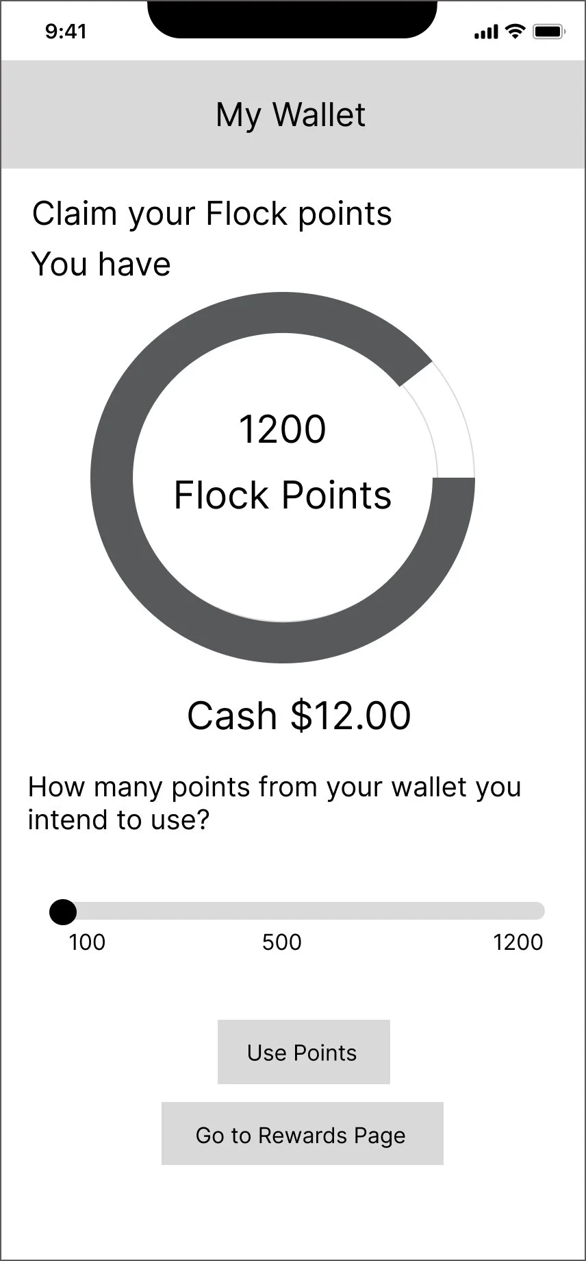
On the my wallet page, the avail Discounts when clicked on showed a drop-down menu. The user did not appreciate this option in the drop-down menu.
Solution 1
On the my wallet page, instead of a drop-down menu against avail discounts, the option of taking the user to a new page was given.
Challenge 2
On the my wallet page, two buttons were given at the bottom. The user found this confusing.
Solution 2
On the my wallet page, one button was removed from the bottom. Also, it was worded in a simpler manner to be more direct and clear.
Challenge 3
On clicking on send points button, when sending to a friend, the message which appeared on the screen was not liked by the user. It stated name and will receive flock points, which was found not very clear by the user.
Solution 3
After clicking on sending points button, an order successful message was made to appear on the screen. This was what the user wanted.
Design System
I created a design system to ensure that a consistent design is applied throughout the app that also aligns with the company’s brand. I gave a light background instead of the earlier darker one.
High Fidelity Wireframes
With the insights gathered from the feedback from the Guerrilla Usability Testing and the design system created, I put together high-fidelity wireframes and assembled a prototype for users to test. I conducted 1 round of usability testing with a group of 10 participants.
I identified areas where users had issues and where the app did well, through usability testing. Below are some of the tasks I had users complete for the Prototype Usability Testing:
Task 1: Avail discounts
Task 2: Claim free product
Task 3: Get cash back in my wallet
Task 4: Share points with friends
Check out the final prototype!
View Prototype
Conclusion
The insights that we got through user interviews and usability testing, helped in meeting the business goals as intended. Based on the positive feedback from the team, the outcome was an overall success. Unfortunately, we had time constraints, we were not able to test the redesigned prototypes with different users. With more time in hand and with various iterations made to the prototypes, we would have performed another round of usability testing. This would have given us feedback on the changes implemented and identified additional usability issues if any.
Reflection
I had an extremely positive experience working directly with the founders and other designers. It was helpful to understand the company's vision and perspective with respect to this project. A designer needs to collaborate closely with her team and I believe that was exactly what I did while working on Project Flock. From the bi-weekly meetings to the final deliverables, communication and alignment with expectations were key to a successful outcome. Even after the completion of the project, I continued making hi-fi designs and prototypes for self-learning.


