Overview
Problem Statement
The major problem with elderly people is medication non-adherence which needs to be addressed on priority. The elderly are not taking their medication on a regular basis. They are negligent towards their diet and health checkups.
An App to assist them with their medical needs is very much needed.
Older adults want to feel in control of their lives
Solution
Care & Care is an intuitive, easy-to-use application for medication and health management. It is designed to be encouraging and supportive for the elderly. Their family members or caregivers can also play a major role in resolving this problem and supporting them.
Care & Care is simple, useful, and easily navigable which can be adopted by the elderly for daily use
MY Role
Lead UX/ UI designer with the help of a mentor June / 156 hours
Responsibilities
User research
Concept ideation
Designing user flows
Prototyping
Visual design
User testing
Incorporating user feedback
Into design iterations
Process
Brainstorming Problems
Following the design thinking process to create a product that users found appealing, I streamlined the content and information from my original plan. I created a more simplified layout that would increase the usability and simplicity of the app.
Empathize
After initial research to become familiar with the health-related issues of the elderly, a competitive analysis of a few medication management apps was conducted.
Competitive Analysis Conclusions
After initial research to become familiar with the health-related issues of the elderly, competitive analysis of a few medication management apps was conducted.
A lot of medication management apps are available for free.
A few have nice features to manage health and medications and are easy and efficient to use.
Not all apps are easy to navigate and learn.
Not many medication management apps are catering to the elderly with possible physical and cognitive issues they may have as they get older.
Identifying the Users
I designed a questionnaire that was forwarded to randomly selected elderly people. Thereafter, data was compiled based on their responses.
User Interviews
Five elderly people were interviewed for the purpose of the research.
All participants had one or more medical problems for which they were on medications.
Some medications were managed by the elderly through online orders via apps.
Participants were split on the need for help to manage their medications.
All participants were using smartphones and were in favor of having an app to manage their health issues.
Most of them wanted health-related tips on the app to keep them fit.
Interview Insights
The attitude of participants regarding technology, their medications, and how it affects their lives :
Affinity mapping
Below is the affinity map I created to organize user insights from the interviews conducted.
Define
To identify why and how the elderly would be interested in using Care & Care, personas, user stories, and problem statements were created.
Coli
She retired five years ago and has a high blood pressure problem. She starts her day with yoga and meditation. She is enjoying her life in a meaningful way and has to be conscientious about her health.
Susan
Susan is married and works with a software company. She cares a lot about her mother and visits her regularly. She loves to read, go on outings and do web designing.
User Stories
Two user stories were created for Coli and Susan when using the Care & Care app:
Adding medication details
Adding reminders/alarms
Later, the user stories were followed to create wire flows.
Have a look at the user stories
Ideation
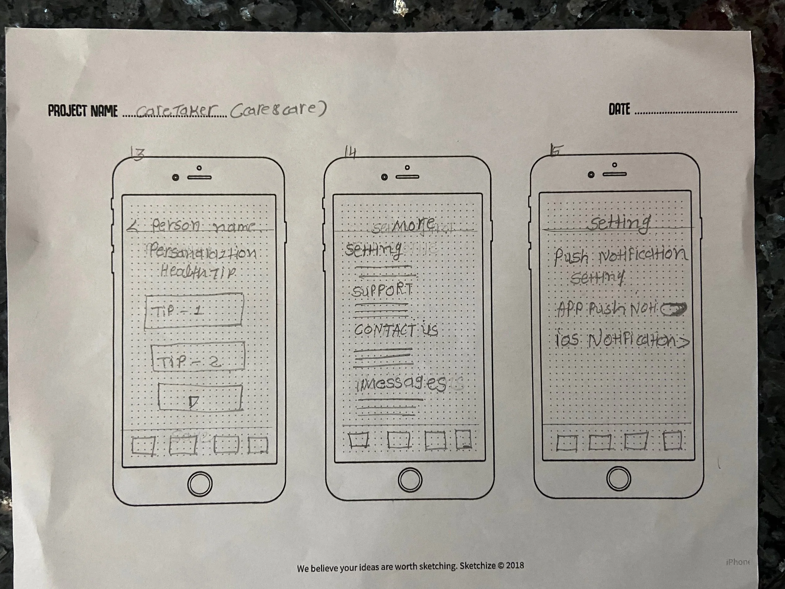
Site maps, wire flows, and wireframe sketches were used for idea generation.
How Might We question?
Potential Solutions
Users needed to be reminded of their daily doses of the medication.
The app should be user-friendly and easy to manage.
Users need health-related tips.
Users need assistance from healthcare workers/family members to aid in better management of their health.
User Flows
I identified the three major paths users could take to achieve the path described in the task flow above.
Patient flow
Caretaker flow
Points to keep in mind while sketching:
Fit all the elements on one screen if possible to reduce scrolling.
Text and touchpoints need to be larger than normal.
Medications may have long names so they should be designed in a way to accommodate even long names.
Maintain consistency between the visuals, elements, and interactions for reducing cognitive load and increasing learnability.
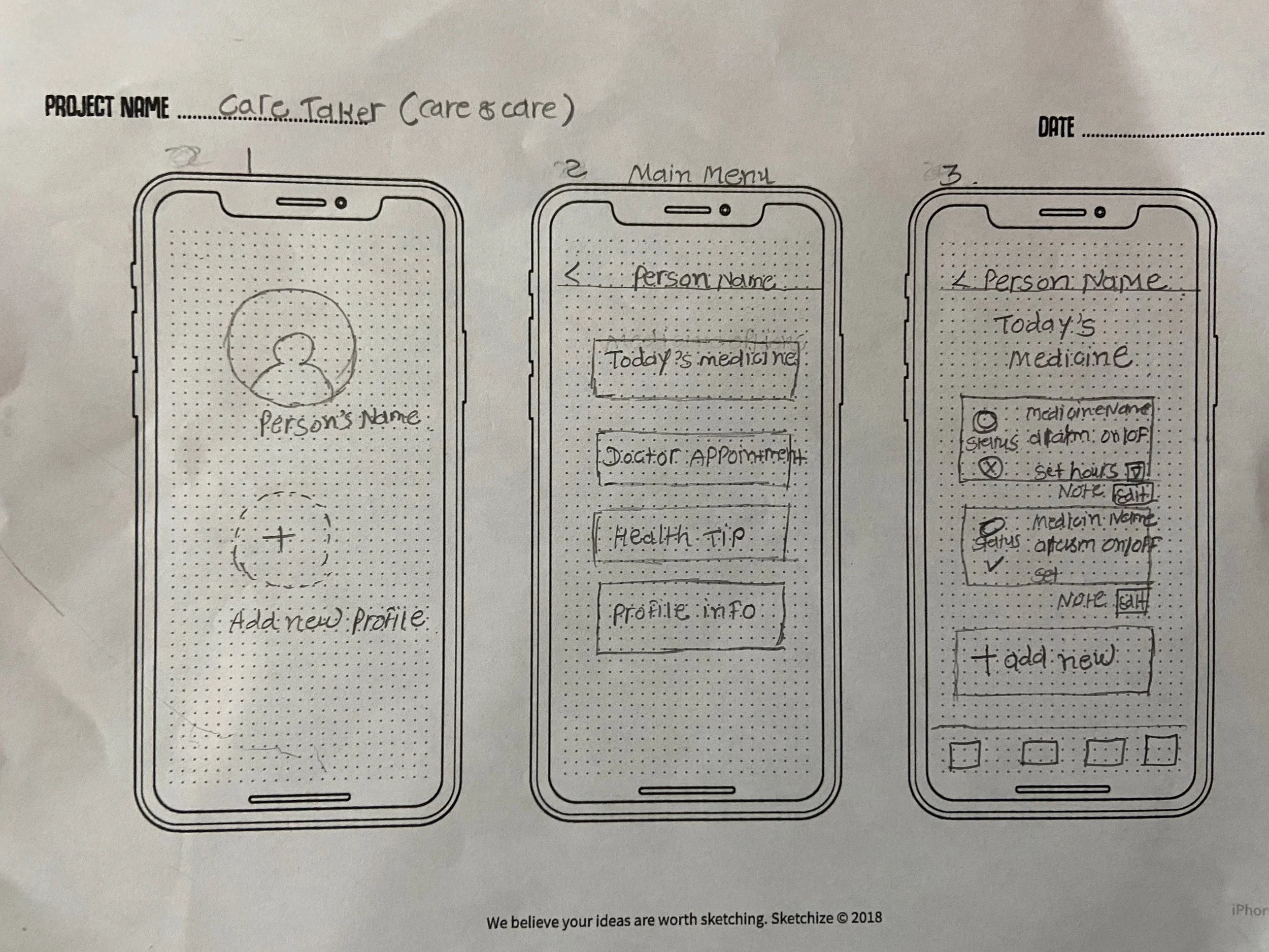
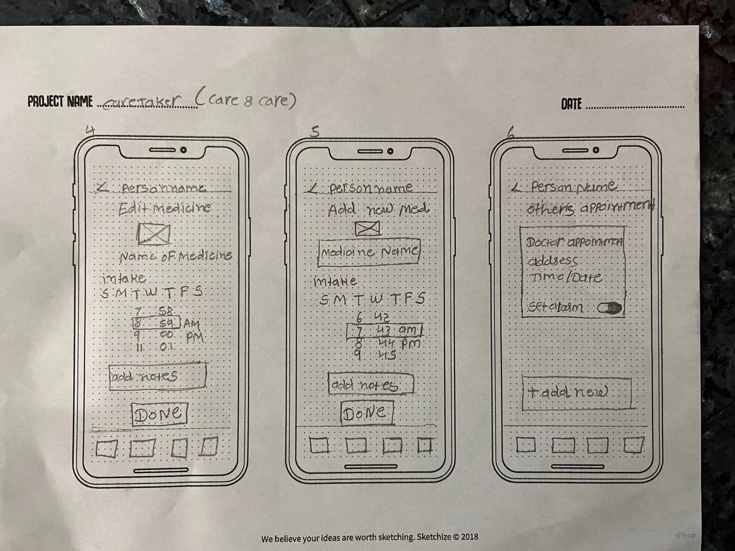
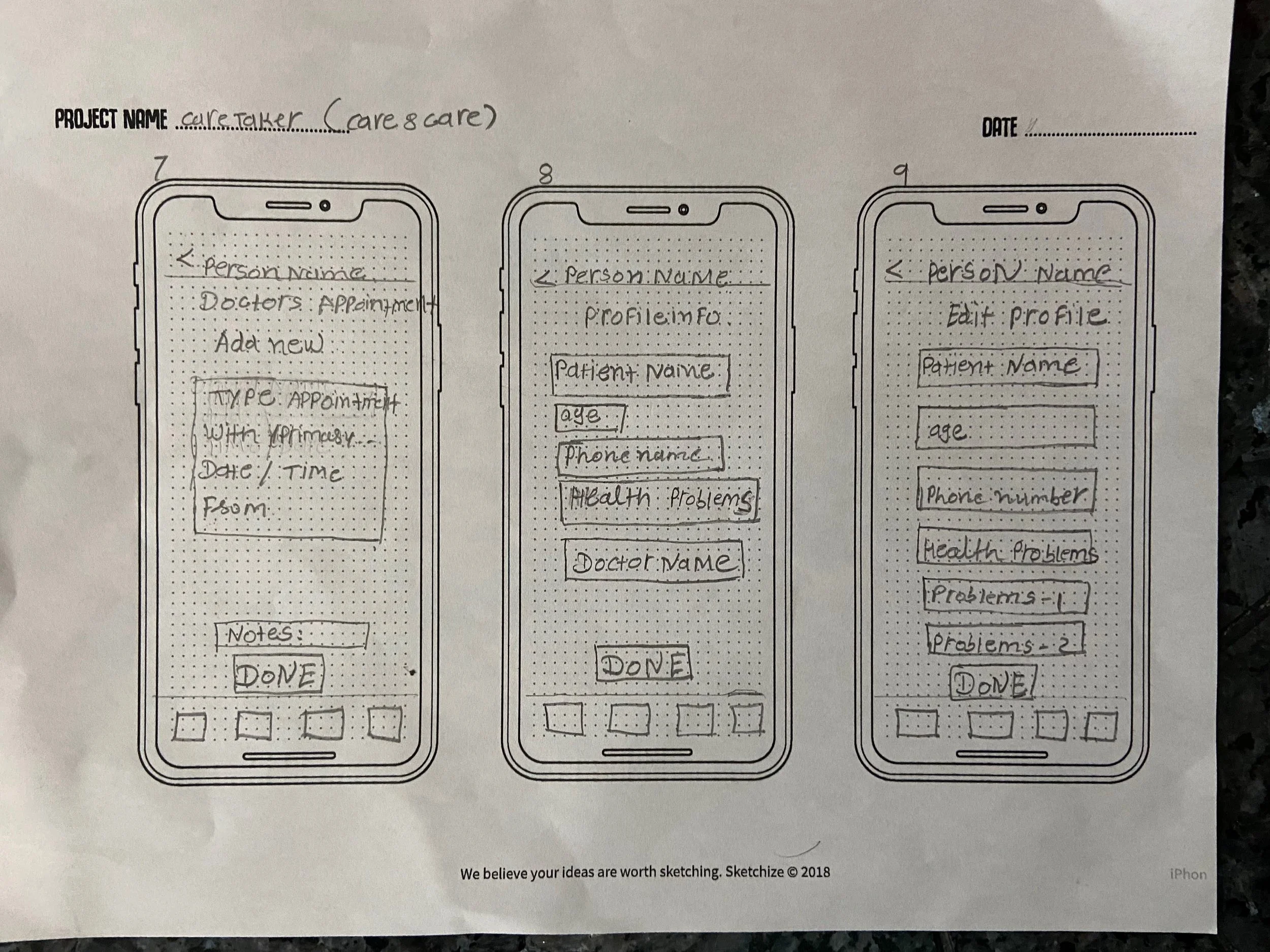
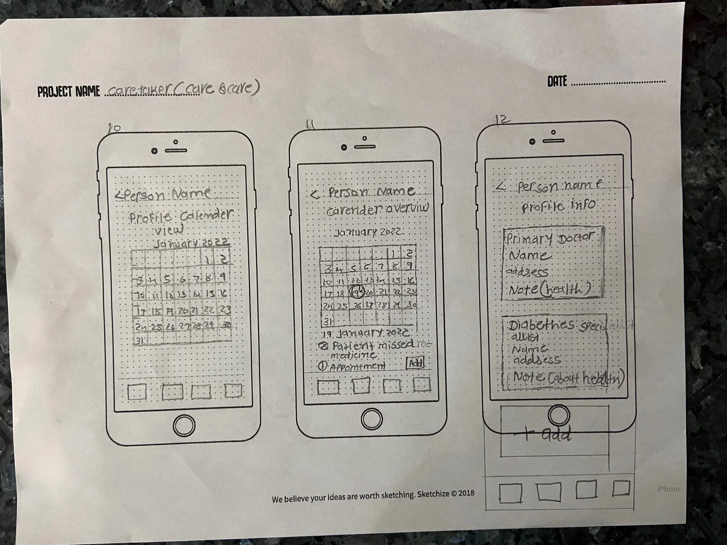
Sketches
The final sketches featured screens for the daily medication reminder list and upcoming appointments or calendar entries.
Patient’s Sketching
Caretaker Sketching
Low Fidelity Wireframes
After sketches were evaluated by the users, the designs were developed into low-fidelity wireframes.
Patient’s wireframe
Caretaker wireframe
Prototyping and Testing
UI Design
The name of the app should communicate the below traits:
Usefulness, support, and self-confidence
Encouragement and control of your life
“Care&Care”
Color scheme and fonts
Before beginning the actual design, I needed to set up an overarching style guide. Starting with colors, I learned that Accessibility is the key. I used WebAIM to ensure that color variations have enough contrast from each other.
For Typefaces, I was venturing into different sets of fonts but arrived at the conclusion that Poppins embodies Care & Care friendliness and modern aesthetics.
High Fidelity Wireframes and Prototyping
With an established design system, I created high-fidelity wireframes and assembled a prototype for users to test. In addition to the flows I had previously tested with users, I added a few additional flows for users to navigate through based on the input given by them. This helped in identifying and adding new areas of improvement.
A total of 2 rounds of usability tests were conducted with 10 different users. The usability testing enabled me to identify where the users had issues or where the application lacked clarity.
Given below are some of the tasks I had users complete for the Prototype Usability Testing:
Create an account and complete the profile
Add details of the medicines
Add their medical appointments
Access health-related tips
Send an invite to caretakers
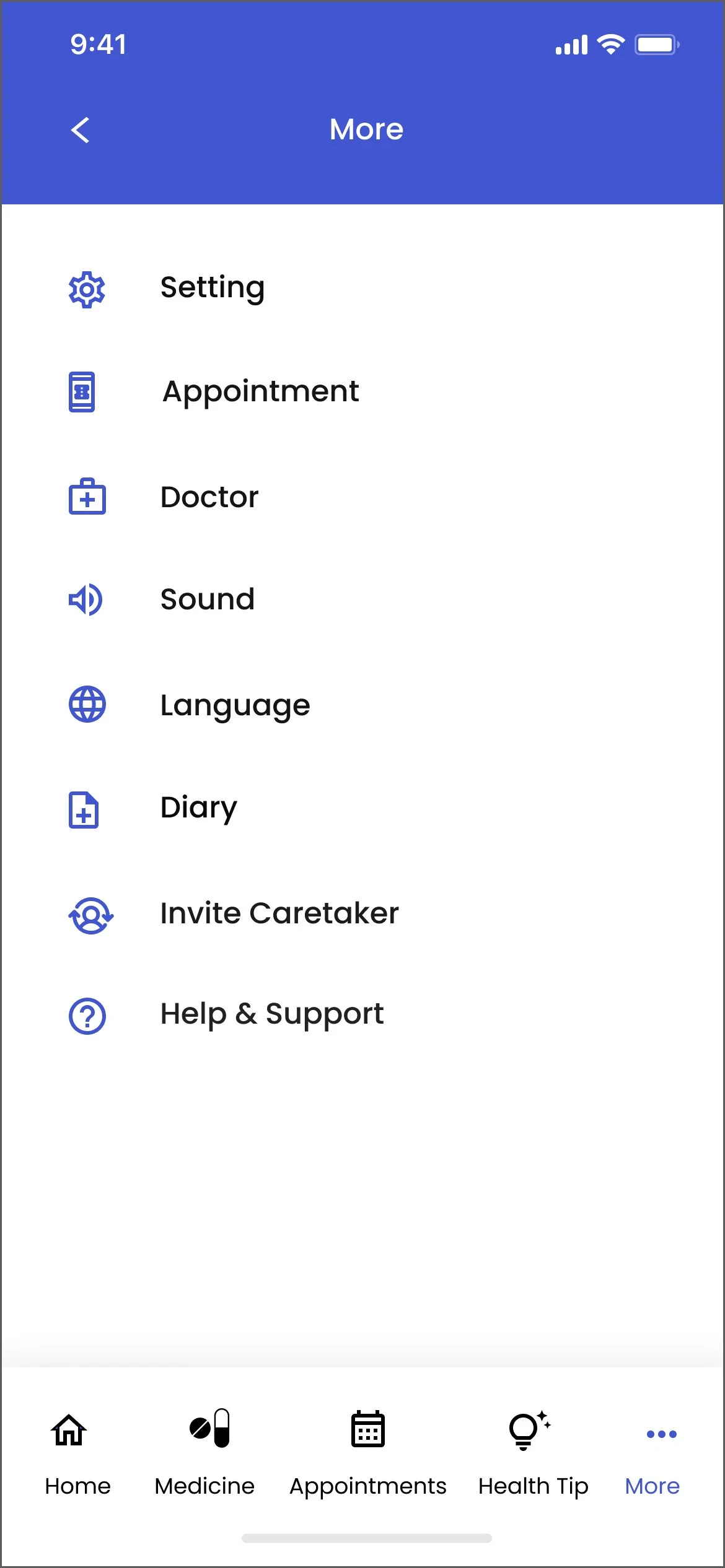
Patient’s Hi-Fi design
Caretaker Hi-Fi design
Prototype Usability Testing - Round 1 Findings
I conducted the first round of usability testing with 5 participants and identified 3 main issues.
Patient’s usability testing
Before
Challenge 1
The skip button was dull and lacked color. The taken icon was small and not easily visible.
After
Solution 1
I changed the color of the skip button from grey to red. This made it quite prominent. The taken icon was shifted from the bottom to the upper portion of the screen and was placed centrally.
Before
After
Challenge 2
The edit medicine page did not have the delete option.
Solution 2
The delete option was added on the edit medicine page.
Before
Challenge 3
The More page did not have the option of adding another family member with medical issues.
After
Solution 3
The option of adding another family member with medical issues was made available on the More page.
Caretaker usability testing
Before
Challenge 1
The appointment page did not have the name of the person whose appointment it was reflecting. Also, the edit icon was found to be quite large.
After
Solution 1
The name of the person was reflected at the top of the appointment page.Also, the edit icon was changed and reduced to a smaller icon
Before
Challenge 2
The caretaker did not have the option of sending the message as a reminder to the user, in case of a lapse in medicine intake.
After
Solution 2
The send message option was made available to the caretaker on their screen.
Prototype Usability Testing - Round 2 Findings
Patient’s usability testing Round 2
Before
Challenge 1
The details of the appointment change were found unnecessary on the calendar page.
After
Solution 1
The details of the appointment change were removed from the calendar page.
Before
Challenge 2
In case the patient skipped the medicine, the reason for the same was not showing on the home page of the caretaker.
After
Solution 2
In case the patient skipped the medicine, the reason for the same was reflected on the home page of the caretaker.
Caretaker usability testing Round 2
Before
Challenge 1
The edit medicine page did not have the delete option.
After
Solution 1
The delete option was added on the edit medicine page.
Check out the final prototype!
Patient’s Prototype
Caretaker Prototype
What's Next for Care & Care?
Since medication adherence is such a widespread issue, I would like to expand this project to a larger target audience through increased user testing and designing more features. The next steps are:
Retesting for efficiency and usability on adjustments made to the prototype based on the first round of usability testing.
Design interfaces for prescriptions from doctors and manual entry of the same.
Design interfaces for online medicine orders.
All navigation, layout, and UI are easily and efficiently recognizable and learnable.
Continue with redesigning the balance of all pages (and onboarding and tutorial instructions) with confirmation through iteration and testing of the efficiency and usability of the entire site.
Reflection
Having created a project like this reinforced my belief and confidence in my design skills.
Following the principles of user-centered design, I created a product that catered to senior users’ needs and goals.
I was able to deliver the value required to overcome the reluctance to use technology that may exist.
Talking to seniors in the original interviews and then during usability testing was very satisfying and inspiring.
Kathy mentioned in her user interview that she didn’t feel the need for such an app.
After the usability testing, however, she felt it was something that she would like to use.


